Float
Float는 가로를 기준으로 content를 어떻게 배치할 것인가에 중점을 두고 있다.
아래는 CSS 에서 Float의 기능을 설명하고 있다.
- left - The element floats to the left of its container
- right - The element floats to the right of its container
- none - The element does not float (will be displayed just where it occurs in the text). This is default
- inherit - The element inherits the float value of its parent
여기서 None은 Default 값을 가지며, 만약 img 를 삽입하였을 때, 글자와 같은 줄에 있다고 판단하게 되어, 아마 거의 쓰지 않을거라 생각한다.
<body>
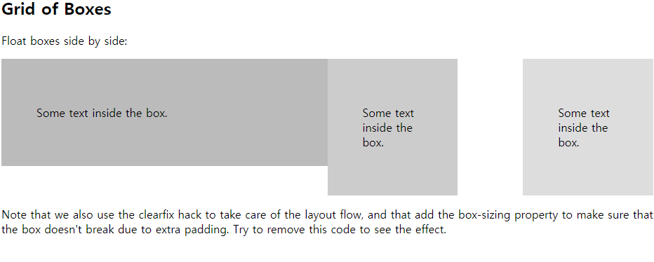
<h2>Grid of Boxes</h2>
<p>Float boxes side by side:</p>
<div class="clearfix">
<div class="box1" style="background-color:#bbb">
<p>Some text inside the box.</p>
</div>
<div class="box2" style="background-color:#ccc">
<p>Some text inside the box.</p>
</div>
<div class="box3" style="background-color:#ddd">
<p>Some text inside the box.</p>
</div>
</div>
<p>Note that we also use the clearfix hack to take care of the layout flow, and that add the box-sizing property to make sure that the box doesn't break due to extra padding. Try to remove this code to see the effect.</p>
</body>HTML 구조
.box1 {
  float: left;
  width: 50%;
  padding: 50px;
}
.box2 {
  float: left;
  width: 20%;
  padding: 50px;
}
.box3 {
  float: right;
  width: 20%;
  padding: 50px;
}
ㅊCSS 구조를 가진다. 이 때 box1이 Float: left를 가지고 있으며, 밑에 같은 구조를 가진다.
이처럼 float는 "content의 흐름을 어디로 할것이냐"가 굉장히 중요하다.
clear
clear은 어떤 content의 float가 정해져 있을 때, clear은 선언한 element 방향으로는 float가 절대 흐를 수 없게 하는 기능이다.
- none - Allows floating elements on both sides. This is default
- left - No floating elements allowed on the left side
- right- No floating elements allowed on the right side
- both - No floating elements allowed on either the left or the right side
- inherit - The element inherits the clear value of its parent
<body>
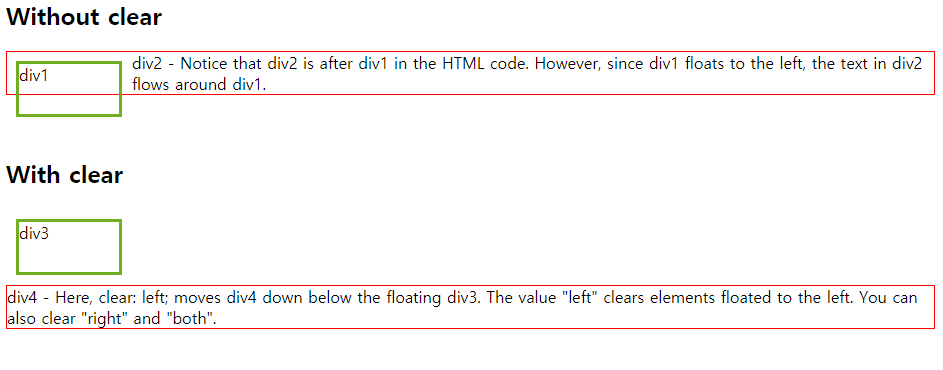
<h2>Without clear</h2>
<div class="div1">div1</div>
<div class="div2">div2 - Notice that div2 is after div1 in the HTML code. However, since div1 floats to the left, the text in div2 flows around div1.</div>
<br><br>
<h2>With clear</h2>
<div class="div3">div3</div>
<div class="div4">div4 - Here, clear: left; moves div4 down below the floating div3. The value "left" clears elements floated to the left. You can also clear "right" and "both".</div>
</body>.div1 {
float: left;
width: 100px;
height: 50px;
margin: 10px;
border: 3px solid #73AD21;
}
.div2 {
border: 1px solid red;
}
.div3 {
float: left;
width: 100px;
height: 50px;
margin: 10px;
border: 3px solid #73AD21;
}
.div4 {
border: 1px solid red;
clear: left;
}다음과 같은 HTML, CSS 구조를 가질 때, 밑에와 같은 구조를 가진다.
즉, div1,div2 에서는 clear을 선언하지 않았으니, 그대로 겹쳐서 나옴을 알 수있다.
이 방법 말고도 직접 위치의 poistioning을 해줄 수도 있지만, 너무 비효율적이다.
또한 div3, div4에 경우는 div3가 float:left 라고 왼쪽방향으로 흐를거라는걸 정의해주었기에,
div4에서 clear:left로 막아버리게 되면, float:left는 막히게 된다.
만약 float:right, clear:left 를 하게되면, clear가 right를 막지 못하였기에, div1,div2 처럼 겹치게 된다.
overflow
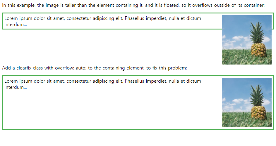
overflow는 If an element is taller than the element containing it, and it is floated, it will "overflow" outside of its container:
즉, 어떤 하위 element가 크기가 overflow 된다면, 상위 태그에 overflow:auto를 걸어줌으로써, container의 크기를 elemt의 content가 벗어나지 않게 한다.
<body>

<p>In this example, the image is taller than the element containing it, and it is floated, so it overflows outside of its container:</p>

<div>
  <img class="img1" src="pineapple.jpg" alt="Pineapple" width="170" height="170">
  Lorem ipsum dolor sit amet, consectetur adipiscing elit. Phasellus imperdiet, nulla et dictum interdum...
</div>

<p style="clear:right">Add a clearfix class with overflow: auto; to the containing element, to fix this problem:</p>

<div class="clearfix">
  <img class="img2" src="pineapple.jpg" alt="Pineapple" width="170" height="170">
  Lorem ipsum dolor sit amet, consectetur adipiscing elit. Phasellus imperdiet, nulla et dictum interdum...
</div>

</body>
div {
border: 3px solid #4CAF50;
padding: 5px;
}
.img1 {
float: right;
}
.clearfix {
overflow: auto;
}
.img2 {
float: right;
}결과는 다음 밑과 같다.
하지만, auto로 하면, 우리가 사이즈도 정확히 정하지 못하고, 튜닝이 어렵다.
따라서 우리는 일일히 지정을 해주는 편이 좋다,
<style>
div {
  border: 3px solid #4CAF50;
  padding: 5px;
}

.img1 {
  float: right;
}

.clearfix::after {
  content: "";
  clear: both;
  display: table;
}

.img2 {
  float: right;
}
</style>
1. clearfix 라는 class를 모든 content 끝나고 뒤에 해줄겁니다~
2. 뭐를요? content를 아무거나 None에 해당하고
3. clear로 float를 양방향 모두 막겠습니다.
4. display를 table 형태로 보여주세요!
5. 대신 img는 마지막에 right에 흘려보낼게요!
위와 같은 방법을 더 많이 쓰니 참고하길!!
'대학원 공부 > programming language' 카테고리의 다른 글
| CSS : Positioning : static, relative, absolute, fixed (0) | 2019.12.15 |
|---|---|
| CSS : Positioning (min-max width, margin, padding) (0) | 2019.12.15 |
| Web : Web Page 구조 구상 및, 설계 방법 (0) | 2019.12.15 |
| HTML : HTML head 구조 (0) | 2019.12.15 |
| CSS : CSS Selector (0) | 2019.12.15 |


댓글